

01Overview
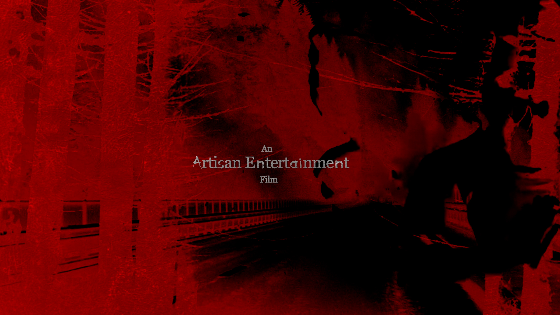
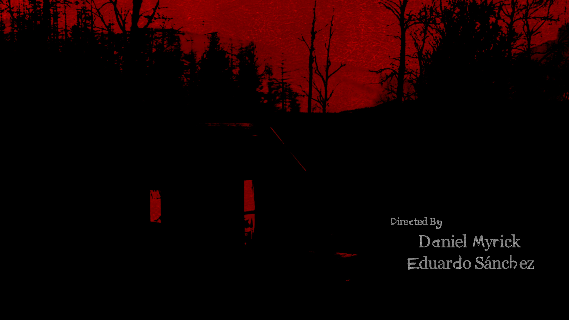
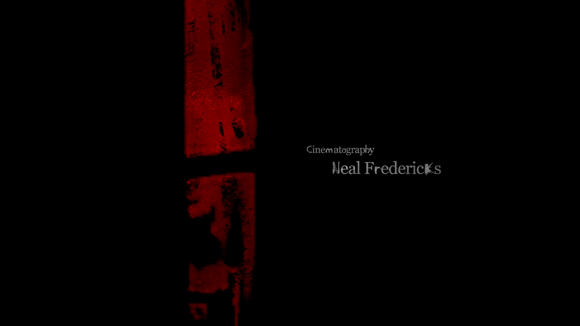
A visual study reimagining the opening titles of The Blair Witch Project leaning into blood-red negative space, scratched typography, and a slow, dread-soaked pacing.
02Approach
Built the sequence around one restraint: only red, black, and a bone-white broken serif. Every card holds the frame just long enough to feel like something is watching from off-screen.
03Outcome
A short-form title piece that trades polish for texture grain, grit, and negative space doing the work that motion usually gets credit for.