01Overview
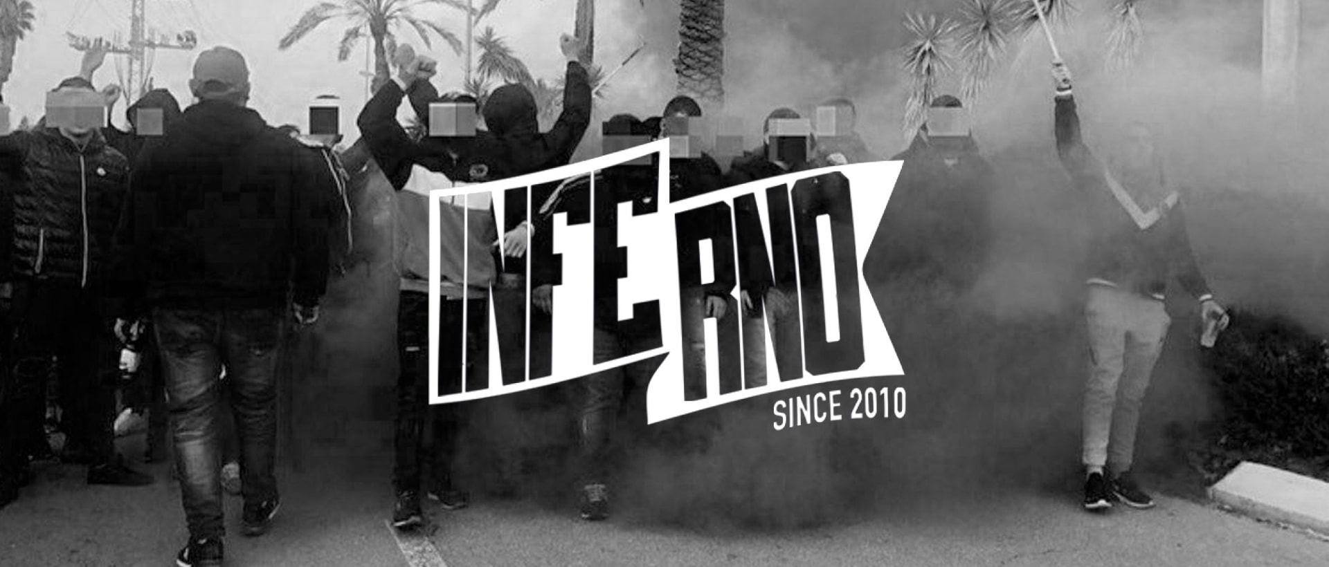
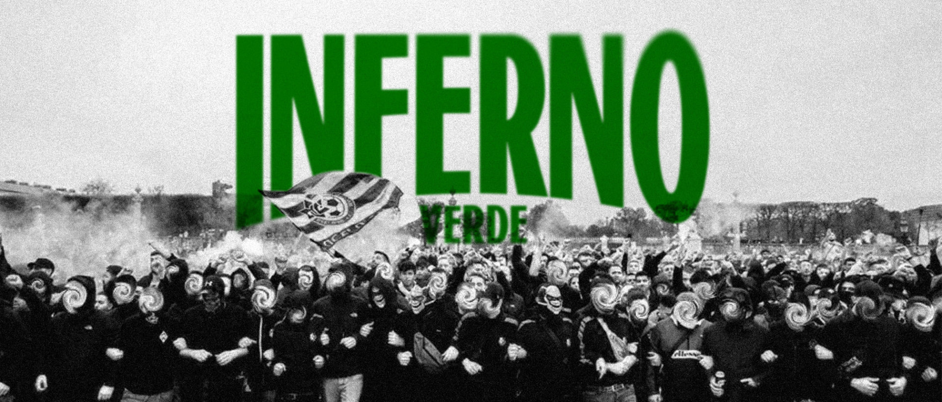
A visual identity for Inferno Verde, built to live on scarves, tifos, hoodies and stadium walls, not just screens.
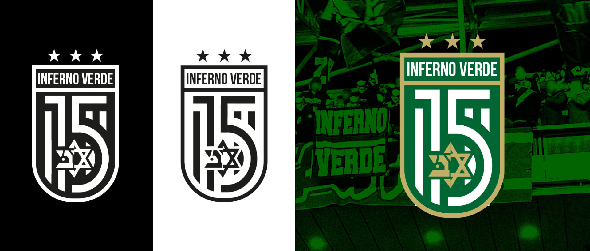
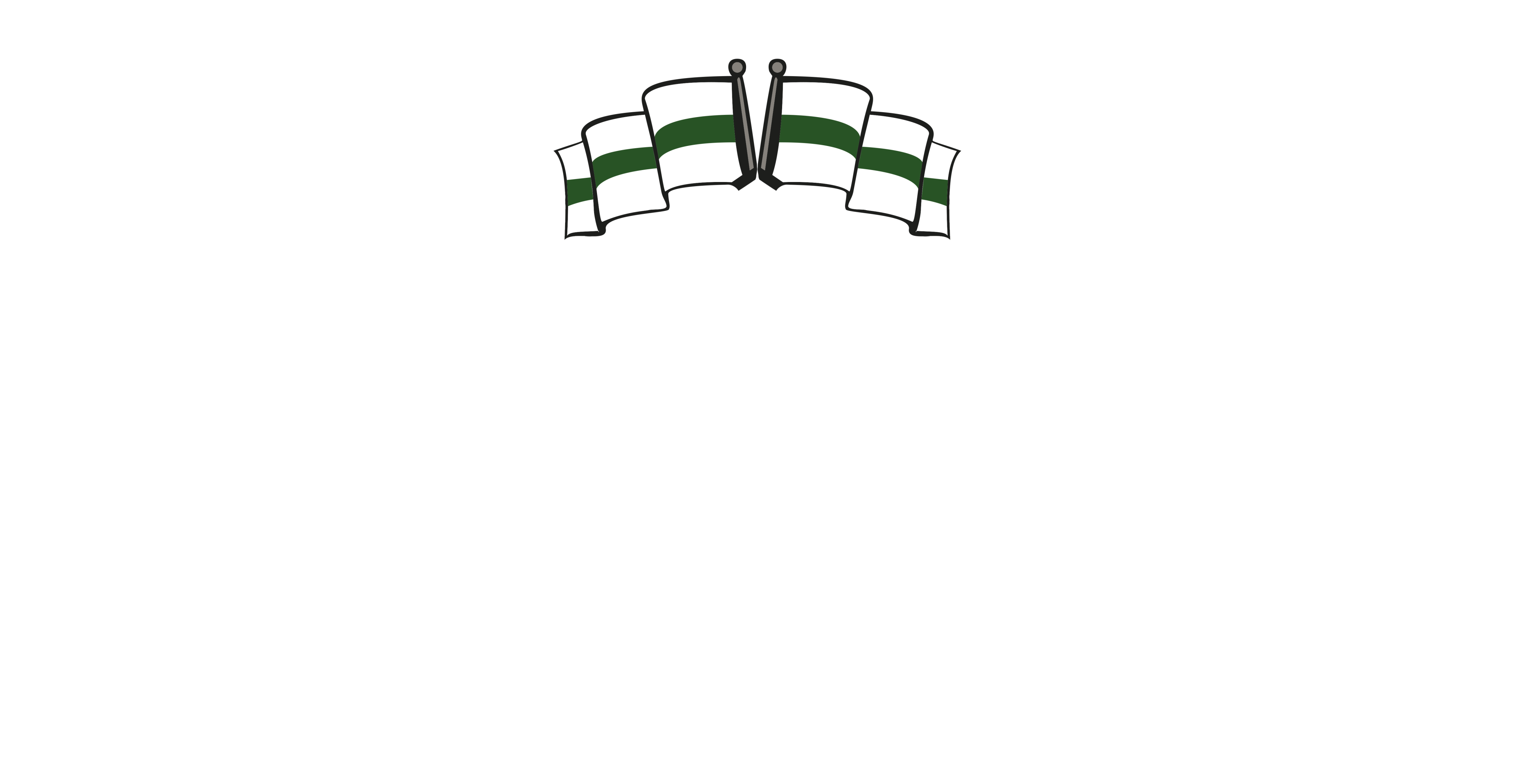
Crest — bone, black and verde. Designed to hold up in stitch, screen print and stencil.
02Approach
Anchored the system in a single palette verde, black, white, and a heavy stencil wordmark that survives paint, print and pyro. Every asset was designed to be reproducible by hand.
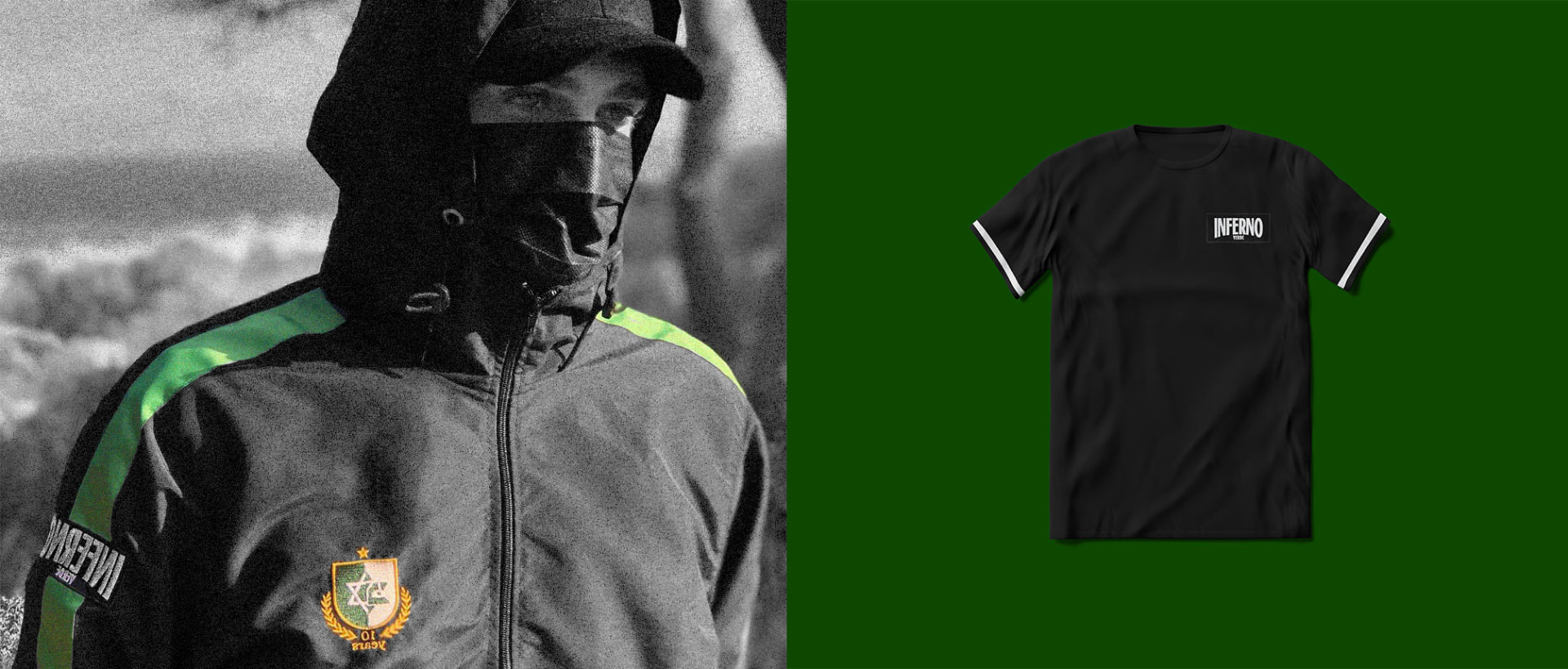
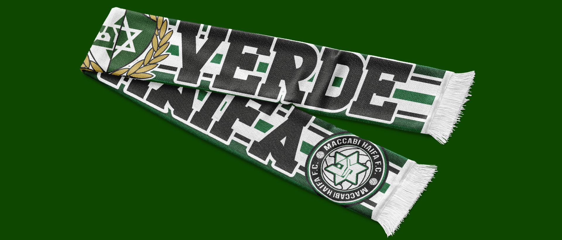
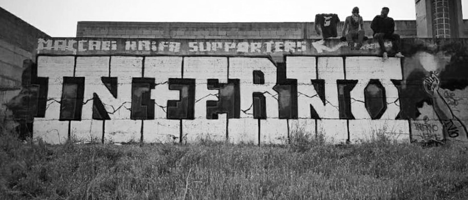
03Outcome
A cohesive identity that scales from a crest on a scarf to a mural on a wall, without losing its voice.